Wildfire exposure assessment#
In this notebook, we will perform a wildfire exposure assessment for transportation infrastructure, specifically focusing on roads. The assessment is based on combining hazard data (e.g., historical footprints of wildfires) with spatial information on road infrastructure to understand how wildfires could impact road infrastructure.
We will follow the steps outlined below to conduct the assessment:
Loading the necessary packages:
We will import the Python libraries required for data handling, analysis, and visualization.Loading the data:
The infrastructure data (e.g., roads) and hazard data (e.g., fire footprints) will be loaded into the notebook.Preparing the data:
The infrastructure and hazard data will be processed and data gaps can be filled, if required.Performing the exposure assessment:
We will overlay the road infrastructure data with data on historical wildfire footprints.Visualizing the results:
Finally, we will visualize the estimated damage using graphs and maps to illustrate the impact on railway infrastructure.
1. Loading the Necessary Packages#
To perform the assessment, we are going to make use of several python packages.
In case you run this in Google Colab, you will need to install the packages below (remove the hashtag in front of them). The installation is split into two steps:
Step 1: Install damagescanner first. Because this upgrades NumPy to a newer version than what Colab has pre-installed, Google Colab will prompt you to restart the runtime after installation — accept the restart. This is necessary to ensure the newly installed NumPy version is actually loaded into memory.
Step 2: After the restart, run the second cell to install contextily. This package is installed separately to avoid the installation to fail due to the requested runtime restart.
#!pip install damagescanner
#!pip install contextily
In this step, we will import all the required Python libraries for data manipulation, spatial analysis, and visualization.
import warnings
import xarray as xr
import numpy as np
import pandas as pd
import geopandas as gpd
import seaborn as sns
import shapely
from tqdm import tqdm

import matplotlib.pyplot as plt
import contextily as cx
from rasterio import features as rasterization
from affine import Affine

from zipfile import ZipFile
from io import BytesIO
from urllib.request import urlopen
from zipfile import ZipFile
import requests
from collections import OrderedDict
from matplotlib.patches import Patch

import damagescanner.download as download
from damagescanner.core import DamageScanner
from damagescanner.osm import read_osm_data
from damagescanner.config import DICT_CIS_VULNERABILITY_FLOOD
from statistics import mode
import rioxarray  # registers the rio accessor

from pathlib import Path

warnings.simplefilter(action='ignore', category=FutureWarning)
warnings.simplefilter(action='ignore', category=RuntimeWarning) # exactextract gives a warning that is invalid
Specify the country of interest#
Before we continue, we should specify the country for which we want to assess the damage. We use the ISO3 code for the country to download the OpenStreetMap data.
country_full_name = 'Togo'
country_iso3 = 'TGO'
2. Loading the Data#
In this step, we will load four key datasets:
Infrastructure data:
This dataset contains information on the location and type of transportation infrastructure (e.g., roads). Each asset may have attributes such as type, length, and replacement cost.Hazard data:
This dataset includes information on the hazard affecting the infrastructure (e.g., flood depth at various locations).
Infrastructure Data#
We will perform this example analysis for Togo. To start the analysis, we first download the OpenStreetMap data from GeoFabrik. In case of locally available data, one can load the shapefiles through gpd.read_file().
infrastructure_path = download.get_country_geofabrik(country_iso3)
Now we load the data and read only the road data.
%%time
features = read_osm_data(infrastructure_path,asset_type='main_roads')
CPU times: total: 7.47 s
Wall time: 16.9 s
sub_types = features.object_type.unique()
Hazard Data#
Wildfire hazard data is exceptionally challenging to work with. The difficulty arises not only from the wide variation in extreme temperatures globally, but also from the myriad factors—such as local vegetation, fuel moisture, and differing infrastructure—that influence fire behavior in each region. Given the complexity of wildfire modelling, there are very few global datasets available to perform such an analysis.
Here we use the GlobFire Fire Perimeters dataset. It offers a comprehensive global record of individual fire events from 2002 to 2023, provided in ESRI shapefile format. This dataset is derived from the MCD64A1 burned area product, a satellite-based product developed by NASA’s MODIS team. MCD64A1 detects burned areas by analyzing changes in surface reflectance and thermal anomalies, which provides a consistent and high-resolution view of wildfire activity around the world. Each fire perimeter in the dataset is documented with a unique fire identification code, along with metadata that includes the initial and final dates, the spatial geometry, and the final burned area in hectares. For a detailed explanation of the methodologies and applications behind this dataset, please see Artes et al. (2019). The full dataset is available for download from the JRC Global Wildfire Information System.
Please note: we require quite a lot of data-specific steps to get this analysis working. As such, different to the other hazards, this approach might be more difficult to quickly re-do with other wildfire data.
We will start by downloading all the wildfire data.
## this is the link to the 1/100 flood map for Europe
zipurl = 'https://effis-gwis-cms.s3.eu-west-1.amazonaws.com/apps/country.profile/GLOBFIRE_burned_area_full_dataset_2002_2023.zip'

# and now we open and extract the data
with urlopen(zipurl) as zipresp:
    with ZipFile(BytesIO(zipresp.read())) as zfile:
        zfile.extractall()
All data is stored as shapefiles. We can directly read them for our area by performing a clip during the reading process.
bbox = shapely.geometry.box(minx=features.total_bounds[0],
                    miny=features.total_bounds[1],
                    maxx=features.total_bounds[2],
                    maxy=features.total_bounds[3])
The rasterized_wildfire_map function converts vector-based wildfire hazard data into a rasterized format, making it compatible with GIS-based hazard and impact assessment models. This step is essential for integrating wildfire risk with other geospatial datasets, ensuring uniform resolution and analysis precision.
def rasterized_wildfire_map(file_path,bbox):

    minx, miny, maxx, maxy = bbox.bounds

    width = maxx - minx
    height = maxy - miny

    if any(np.isnan([minx, miny, maxx, maxy])) or width == 0 or height == 0:
        print(f"Skipping {file_path}: invalid bbox bounds {bbox.bounds}")
        return None

    country_yearly_wildfires = gpd.read_file(file_path,bbox=bbox)

    # List of geometries from the GeoDataFrame
    geom = [shape for shape in country_yearly_wildfires.geometry]

    # Define resolution
    resolution = 0.004

    # Extract bounds (make sure bbox.bounds is correctly defined)
    minx, miny, maxx, maxy = bbox.bounds
    width = maxx - minx
    height = maxy - miny

    # Define the number of rows and columns (note the ordering: rows=y, cols=x)
    rows = int(height / resolution)
    cols = int(width / resolution)

    # Create an affine transform (upper-left corner is (minx, maxy))
    transform = Affine.translation(minx, maxy) * Affine.scale(resolution, -resolution)

    # Rasterize using the shape and coordinate system defined by the transform
    rasterized = rasterization.rasterize(
        geom,
        out_shape=(rows, cols),
    fill=np.nan,
        transform=transform,
        all_touched=False,
        default_value=1,
    dtype=np.float32  # ← changed from None
    )

    # Assume rasterized is your NumPy array from the rasterio.features.rasterize() call
    rows, cols = rasterized.shape

    # Create coordinate arrays for the pixel centers:
    x_coords = minx + (np.arange(cols) + 0.5) * resolution
    y_coords = maxy - (np.arange(rows) + 0.5) * resolution

    # Create the DataArray and name it 'band_data'
    da = xr.DataArray(
        rasterized,
        dims=("y", "x"),
        coords={"x": x_coords, "y": y_coords},
        name="band_data"
    )

    # Set the affine transform and CRS (adjust the CRS if needed)
    da.rio.write_transform(transform, inplace=True)
    da.rio.write_crs("EPSG:4326", inplace=True)

    # Optionally, convert to a Dataset if you want to store multiple variables:
    return da.to_dataset()
As we have saved all data in the current working directory, below we identify the Path towards that directory and collect all shapefiles in this directory. We now assume that no other shapefiles are in this directory.
current_dir = Path.cwd()
shp_files = list(current_dir.glob("*.shp"))
And then rasterize all shapefiles to use them efficiently in our exposure analysis.
wildfires_per_year = {}
for file_path in tqdm(shp_files, total=len(shp_files)):
    year = str(file_path).split('_')[-1].split('.')[0]
    result = rasterized_wildfire_map(file_path, bbox)
    if result is not None:
        wildfires_per_year[year] = result
100%|██████████████████████████████████████████████████████████████████████████████████| 22/22 [05:14<00:00, 14.29s/it]
Ancilliary data for processing#
world = gpd.read_file("https://github.com/nvkelso/natural-earth-vector/raw/master/10m_cultural/ne_10m_admin_0_countries.shp")
world_plot = world.to_crs(3857)
admin1 = gpd.read_file("https://github.com/nvkelso/natural-earth-vector/raw/master/10m_cultural/ne_10m_admin_1_states_provinces.shp")
3. Exposure analysis#
Because the hazard information provides only the possible extent of wildfires and does not provide us with any indication of intensity, we focus on performing an exposure analysis within this example.
We will first run the exposure analyse by year, as the hazard data provides a yearly timeseries.
exposure_per_year = []

for year in tqdm(wildfires_per_year.keys(),total=len(wildfires_per_year)):
    country_hazard_data = wildfires_per_year[year]
    exposed_features = DamageScanner(country_hazard_data, features, pd.DataFrame(), pd.DataFrame()).exposure(disable_progress=True,return_full=False)#'values']

    exposed_features[year] = exposed_features.apply(
        lambda feature: sum([x for x in feature['coverage']]), axis=1
    )
    exposure_per_year.append(exposed_features[year])
100%|██████████████████████████████████████████████████████████████████████████████████| 22/22 [00:45<00:00, 2.05s/it]
And then we can merge the results of all years into a single pd.Dataframe()
all_exposed_features = features[['osm_id','geometry','object_type']].merge(
                                    pd.concat(exposure_per_year,axis=1),
                                    left_index=True,
                                    right_index=True,
                                    how='outer')
4. Save the Results#
For further analysis, we can save the results in their full detail, or save summary estimates per subnational unit. We show how to do this using the exposure results.
all_exposed_features['total_length'] = all_exposed_features.to_crs(3587).length
all_exposed_features.to_file(f'Wildfire_Exposure_{country_full_name}.gpkg')
5. Visualizing the Results#
The results of the exposure assessment can be visualized using charts and maps. This will provide a clear representation of which infrastructure is most affected by the hazard and the expected exposure levels.
To also assess the relative impacts, we estimate the total length of each segment before we continue.
features['total_length'] = features.to_crs(3587).length
base_length = features.groupby('object_type')['total_length'].sum()
And get the exposure by type.
exposure_by_type = all_exposed_features.groupby('object_type')[list(wildfires_per_year.keys())].sum()
And Remove ‘_link’ from the index names and group by the base type (summing the values). This will ensure that we only keep the “base” classes (e.g., primary, secondary, tertiary), making visualisation more convenient.
exposure_grouped = exposure_by_type.copy()
exposure_grouped.index = exposure_grouped.index.str.replace('_link', '')
exposure_grouped = exposure_grouped.groupby(level=0).sum()
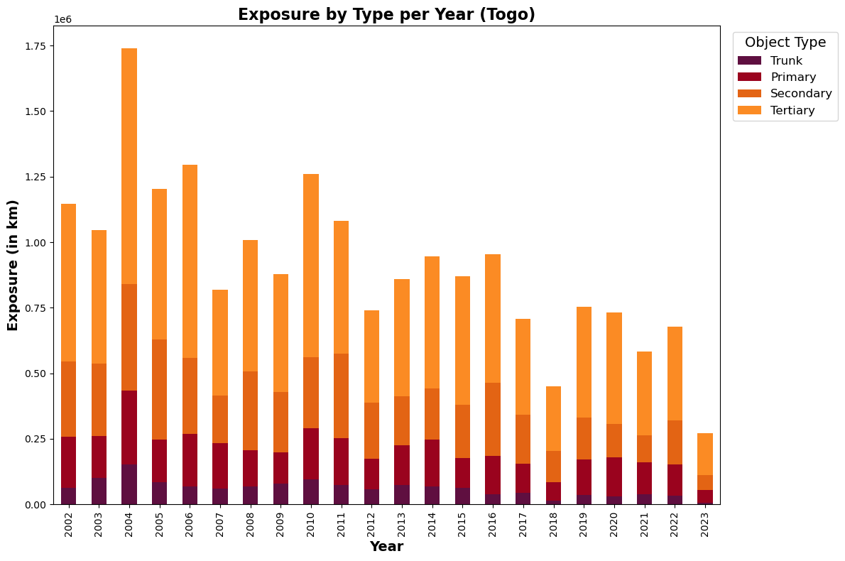
Absolute exposure levels#
# Ensure the order of the rows (which will become columns after transposing)
order = ['trunk', 'primary', 'secondary', 'tertiary']
exposure_grouped = exposure_grouped.reindex(order)

# Define colors for each type:
colors = ["#5f0f40", "#9a031e", "#e36414", "#fb8b24"]

# Transpose the DataFrame so that years become the x-axis
ax = exposure_grouped.T.plot(kind='bar', stacked=True, figsize=(12, 8), color=colors)
ax.set_xlabel("Year",fontsize=14,fontweight='bold')
ax.set_ylabel("Exposure (in km)",fontsize=14,fontweight='bold')
ax.set_title(f"Exposure by Type per Year ({country_full_name})",fontsize=16,fontweight='bold')

# Capitalize legend labels
handles, labels = ax.get_legend_handles_labels()
labels = [label.capitalize() for label in labels]
ax.legend(handles, labels, title='Object Type', bbox_to_anchor=(1.01, 1), loc='upper left',
          title_fontsize = 14, prop={'size': 12})

plt.tight_layout()
plt.show()
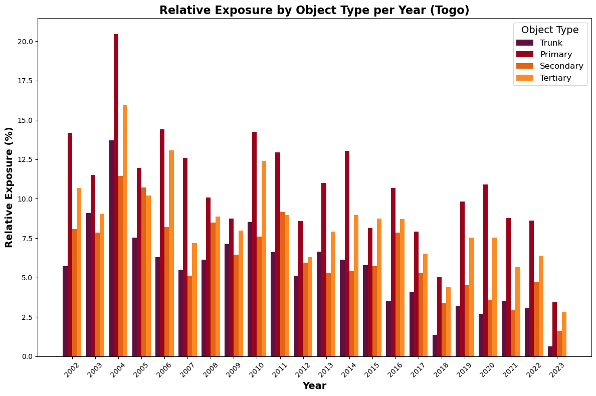
Relative exposure levels#
We first need to make sure that we have the total lengths per object type as well.
base_length_grouped = base_length.copy()
base_length_grouped.index = base_length_grouped.index.str.replace('_link', '')
base_length_grouped = base_length_grouped.groupby(level=0).sum()
And then we can plot the relative exposure results.
# Ensure the object types are in the correct order
order = ['trunk', 'primary', 'secondary', 'tertiary']
exposure_grouped = exposure_grouped.reindex(order)
base_length_grouped = base_length_grouped.reindex(order)

# Compute the relative exposure for each object type and year:
# Relative Exposure (%) = (Exposure / Baseline Length) * 100
relative_exposure = (exposure_grouped.div(base_length_grouped, axis=0)) * 100

# Define colors for each object type
colors = ["#5f0f40", "#9a031e", "#e36414", "#fb8b24"]

# Extract years and object types for plotting
years = relative_exposure.columns.tolist()
object_types = relative_exposure.index.tolist()

# Set up positions for grouped bars
n_years = len(years)
n_types = len(object_types)
bar_width = 0.2
index = np.arange(n_years)

fig, ax = plt.subplots(figsize=(12, 8))

# Plot each object type's bar for every year, shifting the positions appropriately.
for i, obj_type in enumerate(object_types):
    data = relative_exposure.loc[obj_type].values  # relative exposure values for this object type
    ax.bar(index + i * bar_width, data, bar_width, label=obj_type.capitalize(), color=colors[i])

# Labeling the axes and the plot
ax.set_xlabel("Year", fontsize=14, fontweight='bold')
ax.set_ylabel("Relative Exposure (%)", fontsize=14, fontweight='bold')
ax.set_title(f"Relative Exposure by Object Type per Year ({country_full_name})", fontsize=16, fontweight='bold')

# Adjust x-ticks so they appear centered under the groups of bars
ax.set_xticks(index + (n_types - 1) / 2 * bar_width)
ax.set_xticklabels(years, rotation=45)

# Add legend and layout adjustments
ax.legend(title='Object Type', title_fontsize=14, prop={'size': 12})
plt.tight_layout()
plt.show()
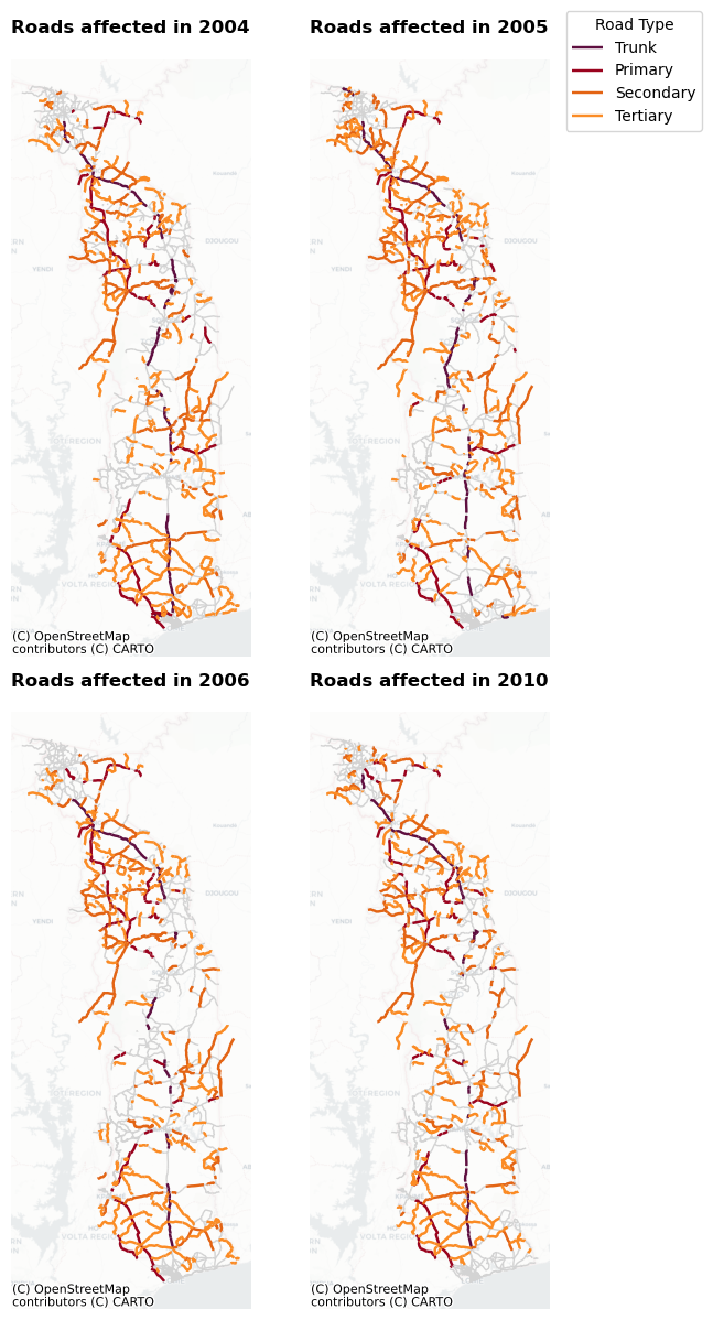
Spatial visualisation#
Now that we have an idea on the years that show the highest level of exposure, let’s spatially plot the four years that show the largest exposure values. This will help us to understand where in the country roads can be affected.
# Ensure the GeoDataFrame 'all_exposed_features' is in EPSG:3857 (required for Contextily)
if all_exposed_features.crs.to_string() != 'EPSG:3857':
    all_exposed_features = all_exposed_features.to_crs(epsg=3857)

# Create a new column 'base_type' that removes the '_link' suffix so that _link roads become part of their base type
all_exposed_features['base_type'] = all_exposed_features['object_type'].str.replace('_link', '')

# Define the years to plot
years = [2004, 2005, 2006, 2010]

# Define the color mapping for the four road types
color_map = {
    'trunk': '#5f0f40',
    'primary': '#9a031e',
    'secondary': '#e36414',
    'tertiary': '#fb8b24'
}

# Create a 2x2 subplot layout
fig, axes = plt.subplots(2, 2, figsize=(6, 12))
axes = axes.flatten()

for ax, year in zip(axes, years):
    # Plot all roads in light grey as the background
    all_exposed_features.plot(ax=ax, color='lightgrey', linewidth=1)

    # Filter for roads affected in this year (non-null value in the year's column)
    affected = all_exposed_features[all_exposed_features[str(year)].notnull()]

    # Limit to the four main road types using the 'base_type' column
    affected = affected[affected['base_type'].isin(color_map.keys())]

    # Plot each road type with its specified color
    for road_type, color in color_map.items():
        sub = affected[affected['base_type'] == road_type]
        if not sub.empty:
            sub.plot(ax=ax, color=color, linewidth=1.75, label=road_type.capitalize())

    # Add basemap using Contextily with a partially transparent CartoDB Positron layer
    cx.add_basemap(ax, source=cx.providers.CartoDB.Positron, alpha=0.5)

    ax.set_title(f"Roads affected in {year}",fontweight='bold')
    ax.set_axis_off()

# Create a consolidated legend using the labels from the first axis
handles, labels = axes[0].get_legend_handles_labels()
unique = OrderedDict(zip(labels, handles))
fig.legend(unique.values(), unique.keys(), title="Road Type", bbox_to_anchor=(1.15, 1))

plt.tight_layout()
plt.show()
And as a final figure, we may want to plot how often certain roads are exposed to wildfires across the time series.
# Define the list of year columns (assumes columns 2002 through 2023 exist)
year_columns = [str(year) for year in range(2002, 2024)]

# Count, for each road, in how many years exposure occurred (non-null values)
all_exposed_features['exposure_count'] = all_exposed_features[year_columns].notnull().sum(axis=1)

# Define bins and corresponding labels for categorization.
# These bins categorize roads as:
# '0' (no exposure), '1-5', '6-10', '11-15', and '16+' (16 or more years of exposure)
bins = [-1, 0, 5, 10, 15, np.inf]
labels = ['0', '1-5', '6-10', '11-15', '16+']
all_exposed_features['exposure_cat'] = pd.cut(all_exposed_features['exposure_count'], bins=bins, labels=labels)

# Define the color mapping for the five categories using your provided color scheme.
color_map = {
    '0': '#fee5d9',
    '1-5': '#fcae91',
    '6-10': '#fb6a4a',
    '11-15': '#de2d26',
    '16+': '#a50f15'
}

# Map the categories to colors
all_exposed_features['plot_color'] = all_exposed_features['exposure_cat'].map(color_map)

# Create the plot
fig, ax = plt.subplots(figsize=(8, 12))

# Plot roads using the assigned color for each exposure category
all_exposed_features.plot(ax=ax, color=all_exposed_features['plot_color'], linewidth=1.5)

# Add the CartoDB Positron basemap with partial transparency
cx.add_basemap(ax, source=cx.providers.CartoDB.Positron, alpha=0.5)

ax.set_title("Frequency of Wildfire Exposure Across the Time Series",fontweight='bold')
ax.set_axis_off()

# Create a custom legend using matplotlib.patches.Patch
legend_handles = [Patch(facecolor=color_map[label], edgecolor='black', label=label) for label in labels]
ax.legend(handles=legend_handles, title="Years with Exposure", loc='upper right')

plt.tight_layout()
plt.show()
